With the feature of Interactive dashboards we can do lot of things. We can create several gadgets, dashboards to consolidate and segregate the CRM data under single roof. In this blog I will explain how you can use the feature to display a basic opportunity forecast chart on the dashboards tab.
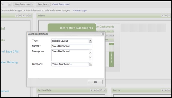
First of all let us create a New Dashboard by clicking on the New Dashboard button as follows.
Now let us create a Chart report. For doing so, go to Main Menu | Reports. Click on Sales category.
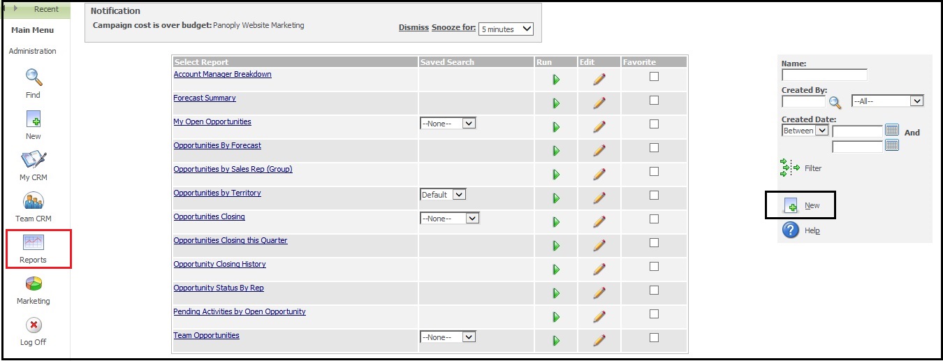
Click on New button to create New report. Configure the report parameters as follows.
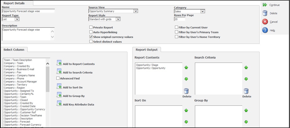
Click Continue button and on next screen set chart options as follows.
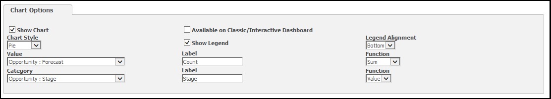
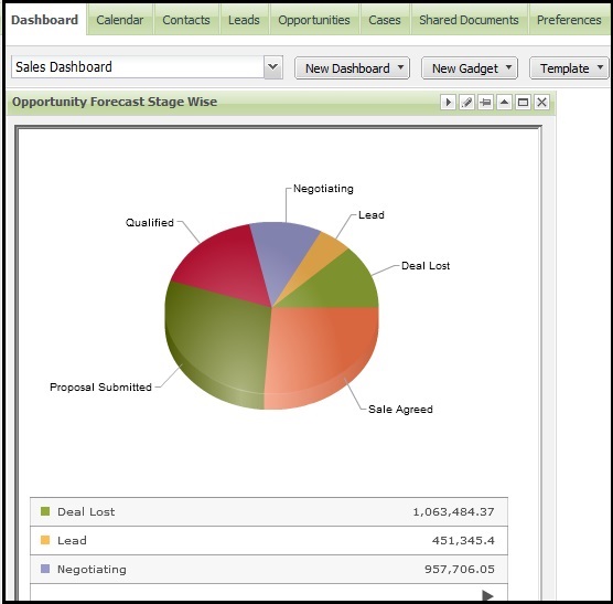
You can see that I have selected Forecast field in the value and Stage as category so our pie chart will be filtered based on the Stage and give sum of forecast. Now Click on Save button to save the report and go to My CRM | Dashboards tab.
Select Sales Dashboard from available dashboards and Click on the New gadget | Create Gadget option to add new gadget to this dashboard. Select Chart type of gadget.
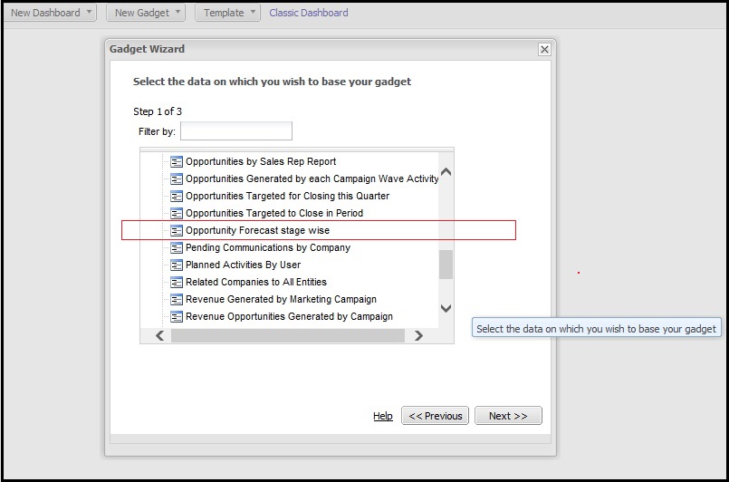
Now select the report you had created under Gadget Wizard and click on Next button.
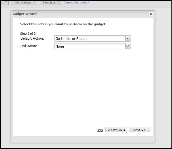
 Select the default loading options as follows and click on Next button.
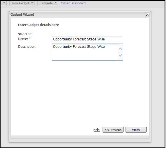
Then enter the gadget details and click on Finish button.
And there comes your chart on dashboard.