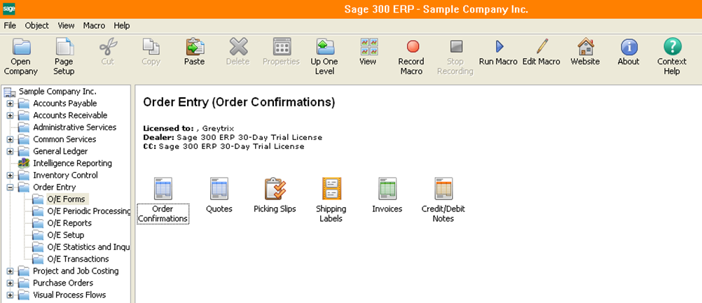
In the upcoming Sage 300 ERP 2014 release, there have been a number of features and improvements added. Let’s have a look on the new and fresh look of the GUI.
Sage 300 ERP 2014’s desktop look has been enhanced by including a new ribbon and icons. The new icons have replaced the old ones on the tool box as well as for all icons appearing on the window. For example the Transaction screen now includes icons other than reports icon.
New Stuff: Material Required to Assemble FG on order – Report
Let’s take a tour on the transaction screen for OE Order Entry. (Refer below screenshot),
– We can see ‘*’ added after the name of a particular field list indicating that these fields are mandatory. These just give you a visual sign of what are the mandatory fields to enter, so that you can avoid the annoying error messages when you save or post a document.
– Also, the new buttons are highlighted in green
– The Finder buttons and the Calendar buttons are also better viewable and understandable by a user.
– Table rows in grid are highlighted in alternating shades to make reading the information entered more easier
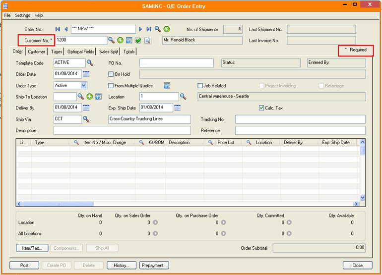
In this way, the new GUI not only increases convenience for a user, but also gives more power and control to the user and eliminates any scope for confusion regarding the functionality of the new icons.