In industries Dashboard plays a very important role for users which provides summarized data of organizations, transactions and masters. Sage X3 has features to show dashboard data into graphical charts like bar chart, Pie chart, line chart & different types of chart. One of our clients has a requirement to represent the data on the dashboard in bar chart format using a graphical query tool.
We have achieved these requirements by following the below steps.
New stuff: Exporting Real Time – SEI Data Models Using Excel Add-In
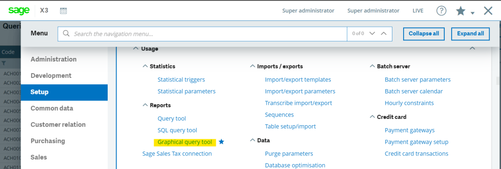
- Open Graphical Query Tool screen through by these path Setup Module –> Reports click on Graphical Query Tool as highlighted in below screenshot:
2. Once clicked, the Below screen will be opened which is the Graphical Query Tool development platform.
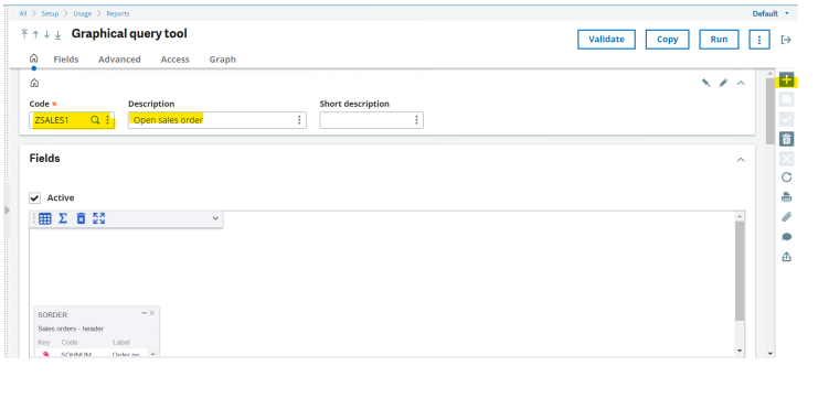
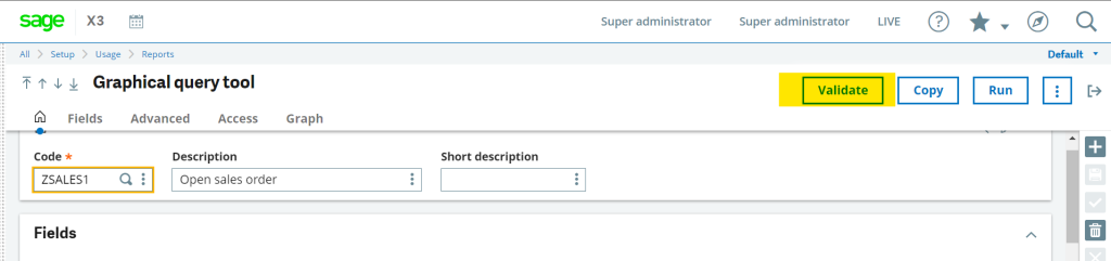
To Create a new graph, click on the + button as highlighted in the above screenshot and then add the code “ZSALES1”(can be as per your requirement) Provide the description in the description field.
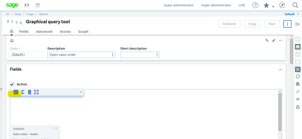
3. Once the Description is provided proceed further with the addition of Tables by clicking on below mentioned icon:
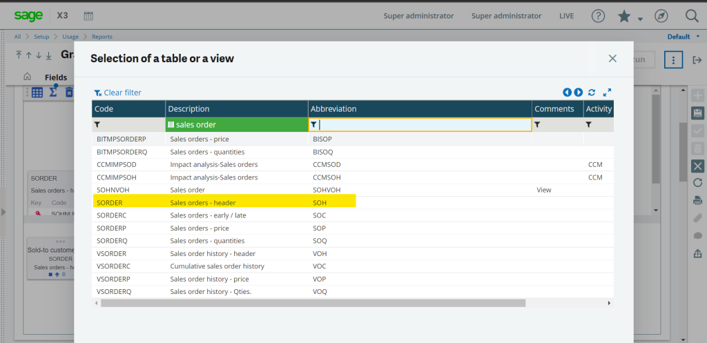
4. Once the above-highlighted icon is clicked, a pop window will open for the selection of the table. From which you can add the table as per your requirement.
5. Once the table is inserted, will proceed further with the addition of the fields, for this double click on the fields from the added tables, accordingly, fields will be added as shown in below screenshot
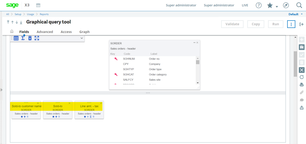
6. To group the data as per your requirement, drag the field slightly towards the up side which will group the data as per the fields as highlighted in below screenshot:
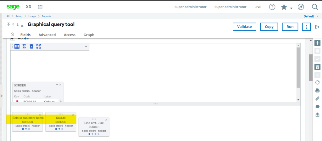
7. To sort the data in particular fields wise, click on the below-highlighted icon which will sort the data in ascending and descending order whenever a query is run:
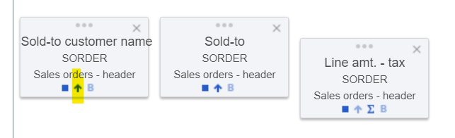
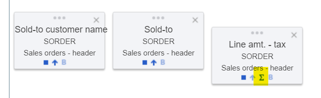
8. To represent the numeric field as a candle in the graph, click on the below-highlighted icon according to which column is ticked, candle will be inserted for the particular field in the graph:
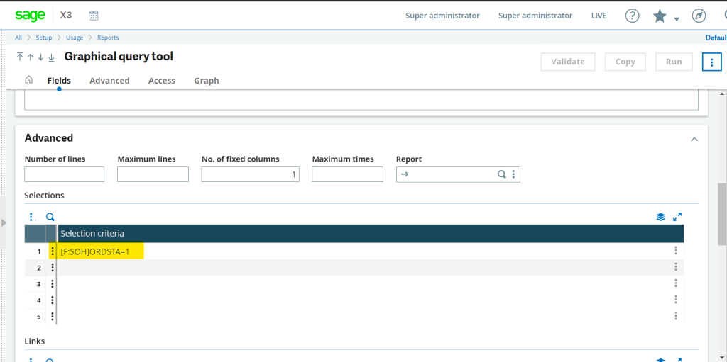
9. To filter the table data for the specific condition we can use the selection criteria functionality where we can define the conditions according to which data in the output will be filtered. For example, to show only open sales orders below the highlighted condition is created.
10. Graphical configuration:
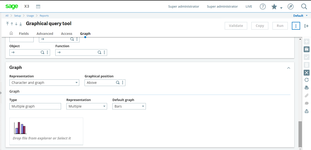
To configure the visual presentation of the graphical query tool above mentioned graph section is used:
i) Representation: Here, we can define whether the user wants to see the graph with a chart or only the graphical representation of the created query.
ii) Graphical Position: Here, we can define the position of the graph whether it should be above the chart or below the chart on the dashboard.
Type: This field is used once there is more than one numeric value in the grid that is likely to be presented in a graphical form. It can take one of two values: Single graph: in this case, only one column of values is displayed at a time (a selector is used to make to choice)/
Multi-graph: in this case, all the columns are displayed, combined according to the parameter defined by the parameter Representation.
iii) Default Graph: To choose the graphical representation in the form of Bars, Lines, and Areas accordingly the system will generate the graph.
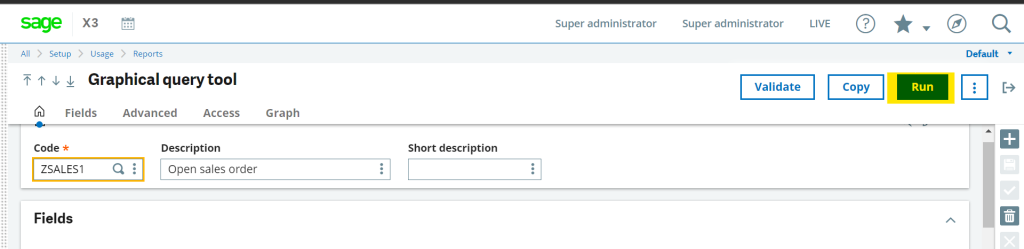
11. Once the query is configured and created next step is to validate the query by clicking on the below-highlighted “validate” button:
12. After the Validation process, To execute the query click on the run button:
13. You can confirm the output as shown in below image before adding to the dashboard:
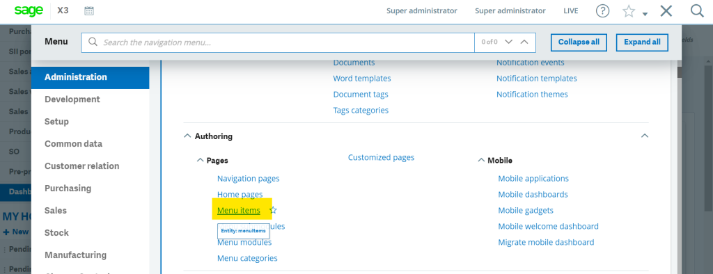
14. Now, to add the created graph on the dashboard below procedure should be followed:
Go to the Administration module click on Menu Items as shown in below highlighted image:
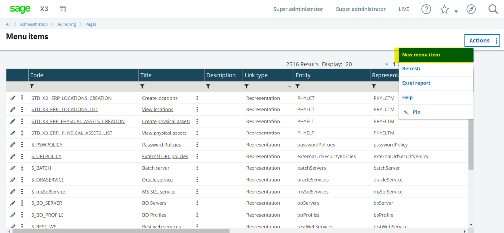
15. Create a new Menu Item by clicking on “new Menu Item” button as shown in below image:
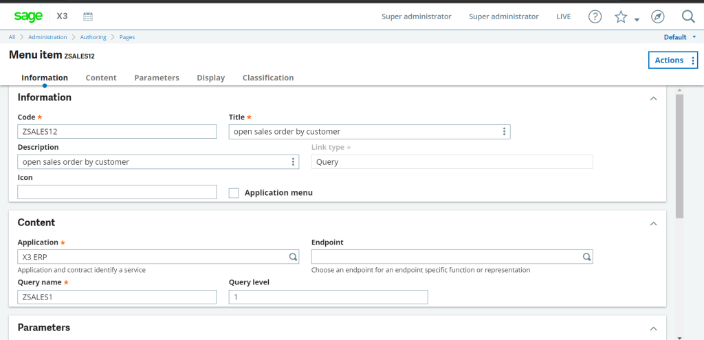
16. Add the information as Code, Title, Description select Link Type as “Query”, select the X3 ERP application in the application field and enter the query name which will be the graphical query tool code.
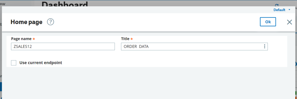
17. Once the menu item is created go to the dashboard and click on “+new” button as highlighted button in below image:
18. This will open the below pop-up In which define the page name and title for the dashboard.
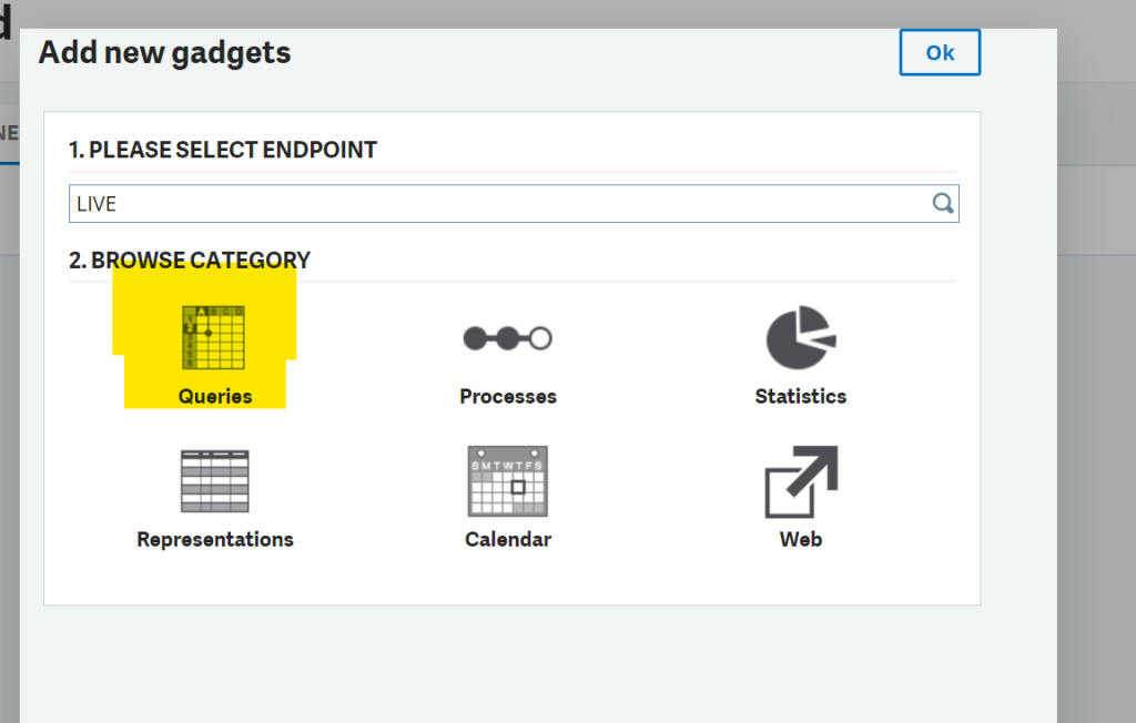
19. After clicking OK on the above screen, the below screen will get pop up in which select the Endpoint as LIVE, and in the browse category select Queries as highlighted in below image:
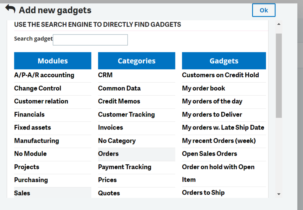
20. Here, select the query name by navigating to the specific module categories gadgets”
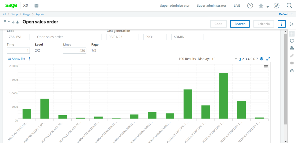
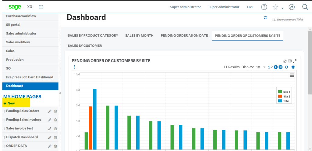
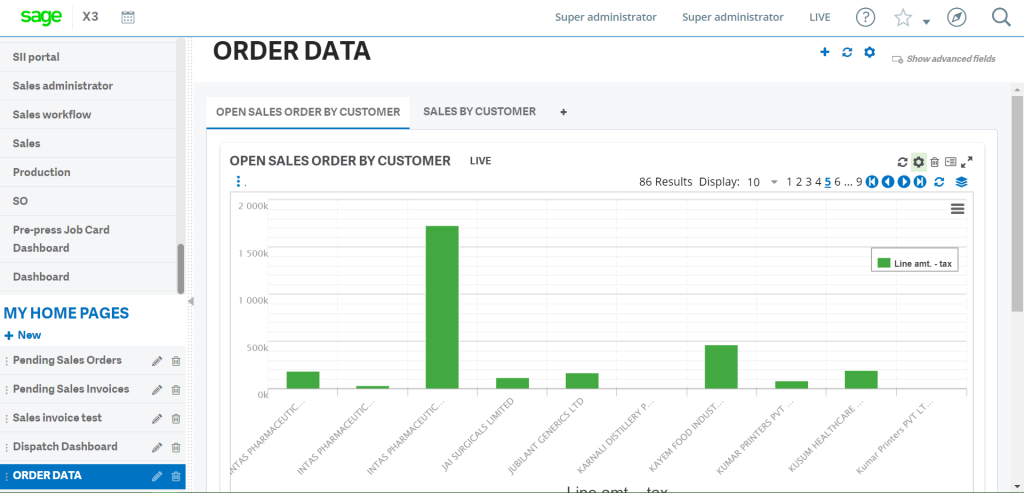
21. Final output will be represent as shown in below image:
This way we can create a graphical query tool query with a bar chart and adding the same to the dashboard.
About Us
Greytrix – a globally recognized and one of the oldest Sage Development Partners is a one-stop solution provider for Sage ERP and Sage CRM organizational needs. Being acknowledged and rewarded for multi-man years of experience and expertise, we bring complete end-to-end assistance for your technical consultations, product customizations, data migration, system integrations, third-party add-on development, and implementation competence.
Greytrix has some unique integration solutions developed for Sage CRM with Sage ERPs namely Sage X3, Sage Intacct, Sage 100, Sage 500, and Sage 300. We also offer best-in-class Sage ERP and Sage CRM customization and development services to Business Partners, End Users, and Sage PSG worldwide. Greytrix helps in the migration of Sage CRM from Salesforce | ACT! | SalesLogix | Goldmine | Sugar CRM | Maximizer. Our Sage CRM Product Suite includes addons like Greytrix Business Manager, Sage CRM Project Manager, Sage CRM Resource Planner, Sage CRM Contract Manager, Sage CRM Event Manager, Sage CRM Budget Planner, Gmail Integration, Sage CRM Mobile Service Signature, Sage CRM CTI Framework.
Greytrix is a recognized Sage Champion Partner for GUMU™ Sage X3 – Sage CRM integration listed on Sage Marketplace and Sage CRM – Sage Intacct integration listed on Sage Intacct Marketplace. The GUMU™ Cloud framework by Greytrix forms the backbone of cloud integrations that are managed in real-time for the processing and execution of application programs at the click of a button.
For more information on our integration solutions, please contact us at sage@greytrix.com. We will be glad to assist you.